Showing posts with label pens. Show all posts

Sunday, October 30, 2016

Persnickety About Paper

Last week, I received two paper samples to review. (Thanks, Exaclair!) The first is an 80 gram sheet of classic grid paper from a Rhodia Reverse Book, the second is 80 gram paper from a new Rhodia dot grid book.

As expected, the paper quality is without question and all the writing implements I tested -- fountain, ballpoint, and gel pens, as well as a mechanical pencil -- wrote smoothly, without bleeding, feathering or skipping.

My preference, however, is for the classic grid, which I find easier to use to ensure writing in straight lines. I do, however, appreciate the near invisibility of the dot grid paper. So, I can't help but ask if Exaclair would consider creating a classic grid that's less prominent in color and "boldness" than its current classic grid paper.

What say ye, Exaclair?

Thursday, March 3, 2016

Thanks, Quo Vadis...You Made a “Habaliever” Out of Me!

As nice as it was to learn that I’d won a Quo Vadis Habana notebook in a recent giveaway, it was even nicer to receive it in the mail!

Although the color wasn’t up to me, I love the “circus peanut” orange of the 4x6 hardcover notebook with the matching elastic closure. Its 80 sheets of 85 g/m2 paper are a complementary ivory (I’d call it “vanilla”) with fairly-close-together gray lines for writing – more along the lines of college ruled than wide ruled (pun intended!). A black page marker, a back pocket, and a sewn binding, allowing the book to lay flat, round out the features of this little gem.


The paper – smooth but not slick – takes various inks well, which is exactly what I’ve come to expect from the Clairefontaine brand. Among others, I tested these fountain pens: Schneider, Pilot Metropolitan, Platinum Preppy, and Lamy Vista.

Although I’m partial to the flow of fountain pen ink on this paper, other pens – including a Liquid Flair, a Sharpie, a Le Pen, a regular Flair, a Paper-Mate Ink Joy, and a Uniball Vision Elite – performed well also, with virtually no show through on the opposite side.

I intentionally used the last few pages of the book for this testing so the balance will be available for notes, lists, observations, and the what-not of daily life that I intend to record in my new Habana. It’s the perfect size for a backpack, tote bag, or purse, and that’s exactly where I intend to carry mine.

Thursday, May 28, 2015

No Surprises Here

Having been participating regularly in the #RhodiaPaperProject, I won't surprise anyone with the news that I loved the most recent samples as much as any that have come before.

Week #17 included three different sheets of 90g blank white paper:
  • GraFit Sketch Pads (the smallest)
  • Trophee Sketch Pads (the middle size)
  • Crok' Book (the largest size)
Week #18 samples included four sheets of ivory, lined paper:
  • Rhodia Webnotebook  90g (small)
  • Quo Vadis Habana 85 g (small)
  • Rhodia Webnotebook 90g (large)
  • Quo Vadis Habana 85g (large)

Of course all the samples are smooth, high quality, and accommodated the wet, heavy inks I prefer -- with no bleed through, no feathering, and no smudging.  The Week #17 samples are best suited for sketching or doodling, and I certainly will use them for that purpose.

By contrast, the lines on the Webbie and Quo Vadis samples make them best for writing. Although I like the size of the large Quo Vadis Habana sheet, the line spacing on the page is too tight -- and not nearly wide enough to accommodate my large writing.  The same is true for the small Quo Vadis and Webbie samples.  Only the large Webnotebook sample has a line width that will accommodate my penmanship adequately, although I could adjust my writing to be able to use the narrower ruled sheets.

Looking forward to Week #19 paper samples and to more experimentation with paper and pens!

Saturday, April 25, 2015

#RhodiaPaperProject: Sweet 16 for Week 16

Week #16 of the #RhodiaPaperProject turned out to be “Sweet 16” when I received three different sized Exacompta 205 g index cards in colors that remind me of creamy birthday cake frosting:
  • One 3x5” card in a pretty muted baby pink
  • One 4x6 card in a matching baby blue
  • One 5x7 card in a buttery pale yellow

Monday, March 16, 2015

#RhodiaPaperProject: Yet Again, 90g is the Winner

Now that the #RhodiaPaperProject happens ever other week, I think I anticipate the arrival of paper samples twice as much.  I was glad to receive Week 14 samples in the mail a few days ago and to try out various inks on them this evening.

Friday, February 13, 2015

ICYMI

In case you missed it, I'm the subject of today's inaugural "Featured Reader" column on the Quo Vadis blog.

Just another stop on the way to finding a niche in the wonderful world of pens and paper!

Thanks, Quo Vadis!

Friday, February 6, 2015

Fountain Pens and the #RhodiaPaperProject: A Perfect Match

Two weeks ago, January 23, was the 278th anniversary of John Hancock's birth. In honor of his status as the first signatory -- and his bold signature -- on the Declaration of Independence, the Writing Instrument Manufacturers Association (WIMA) designated the the date as National Handwriting Day, providing "a chance for all of us to re-explore the purity and power of handwriting."

Sunday, January 18, 2015

Doodler's Delight

Last week (Week #10 of the Rhodia paper project), I received three ruled paper samples in the mail:

  • Clairefontaine Triomphe (white)
  • Clairefontaine 90g (white)
  • The R by Rhodia (ivory)

Sunday, December 28, 2014

The #RhodiaPaperProject is Creating a Pen Snob

I think the #RhodiaPaperProject is transforming me into a pen snob.

Either that or it's providing weekly confirmation that my preference runs toward thicker points and wetter inks, which leads me to believe it's time to invest in other than a disposable fountain pen.

Wednesday, December 17, 2014

Exaclair Papers: Two Weeks' Samples For the Price of One

I've fallen behind in my review of the Exaclair paper products that arrive regularly in my mailbox.

The Week 7 samples are:
  • The Classic Rhodia Meeting Book 
  • The Rhodia Meeting Book 90 

Wednesday, December 10, 2014

Clairefontaine Classic Notebook Paper: Pros and Cons

As they have for the last six weeks, a number of different paper samples once again arrived in my inbox from Karen Doherty, vice president of marketing at Exaclair, USA, as part of the Rhodia Paper Project.  Included were three different pages of Clairefontaine Classic 90g bright white paper from spiral bound notebooks.


Most appealing was the silky smooth feel of the paper, which had a solid weightiness to it, without being too heavy.  It stood up well to thick, liquidy inks (fountain pen, liquid Flair and Bic Atlantis), which were the most pleasant to use.  Requiring more "push" -- and least appealing of the writing instruments -- were a Paper Mate mechanical pencil and a Bic four-color retractable medium point ballpoint.  Squarely in the middle on the ease-of-use scale were a Marvy LePen and a Uniball Jetstream ballpoint pen.

Although the paper itself was the same in all three samples, my favorite was the lined version because of its perforation to remove the scraggly left-hand edge when pages are torn from the notebook.  Neither the lined paper with the margin nor the French ruled sample includes this perforation.  Least appealing was the French ruled sample.  I found its many vertical and horizontal lines to be a distraction -- both when writing on it and, later, when reading what had been written.

Looking forward to receiving the next batch of paper samples, which should be on their way to me shortly.

Stay tuned...

Saturday, November 29, 2014

(Paper) Size Does Matter

This week's Rhodia Paper Project brought me one sheet each of 80g white Rhodia line ruled paper in these sizes:
  • No. 8, (3 x 8 ¼”)
  • No. 10 (2 x 3″) 
  • No.16 (6 x 8 ¼ “)
  • No. 19 (8 ¼ x 12 ½ “)
The paper itself is a crisp white with horizontal violet lines.  The No. 16 and 19 samples also include a red vertical line indented from the left margin, making it reminiscent of the filler paper I used in elementary school -- minus the holes.

Smooth to the touch -- without being glossy -- the sample paper took a variety of inks extremely well, from no-name ballpoints to medium point felt-tip and liquid Flair pens, and from Marvy's LePen to Bic's four-color, medium point retractable ballpoint pen.  None -- not even the Pilot Varsity fountain pen -- showed through on the reverse side.

My personal preference with regard to size is the No. 8, which would be extremely useful for all kinds of lists:  wish lists, to-do lists, grocery lists...and more.  I'm sure I could find countless uses for the No. 16 -- in the office for recording meeting notes, phone conversations and like, or as a catch-all paper source in my tote bag for notes, lists and observations on the go. The dimensions of the No. 19, I think, are too large for anything but a stay-on-the desk pad. Originally, I thought the dimensions of the No. 10 made it too small to be useful, but in reconsidering the sample, I'd love to see this size as a sticky note -- in both lined and unlined versions -- which would make it endlessly useful.

Once again, the Rhodia Paper Project has provided interesting and unique paper samples to test, and I'm grateful for the opportunity to offer thoughts and feedback.

Sunday, November 16, 2014

More Papers, More Pens, More Testing

In yesterday's mail, I received paper samples for The Paper Project Week #4, which included an Exacompta index card (Pastle/Violet/Grid 205g) and a sheet from the Clairefontaine multiple subject notebook (Pastle/Violet/Grid 90g).


Although I appreciated the way various inks took to both paper types, and I was happy enough with the medium smooth texture of the notebook paper, I especially enjoyed experimenting with the index card.  And, as I have throughout these weeks of experimentation, I tested a variety of pens -- from lowbrow "no names" to drugstore "cheapies," before moving up to a Sharpie, a few PaperMates and a Bic or two, and finally my Pilot Varsity fountain pen.  No Shaeffer, Mont Blanc, or Lamy here....yet!

In this round of testing, I enjoyed the pastel shades of the samples -- pale blue on the one from the notebook, and pale green and baby pink on the index cards, all with violet grid lines -- which were a welcome change of pace from the ubiquitous white and ivory that are the norm from day-to-day.

Having now participated in The Paper Project for nearly a month, I increasingly find that regardless of the paper, I much prefer pen points (and inks) that are thicker and smoother -- Pilot Varsity, Liquid Flair, and the "regular" Flair, for example -- and thus seem to require less pressure when writing.  Similarly, I generally appreciate grid lines and do not find them to be a distraction in my work.


I look forward to ongoing opportunities to sample -- and write about -- Exclair papers in the weeks ahead.

Wednesday, November 5, 2014

Goldilocks and the Exaclair Paper Samples


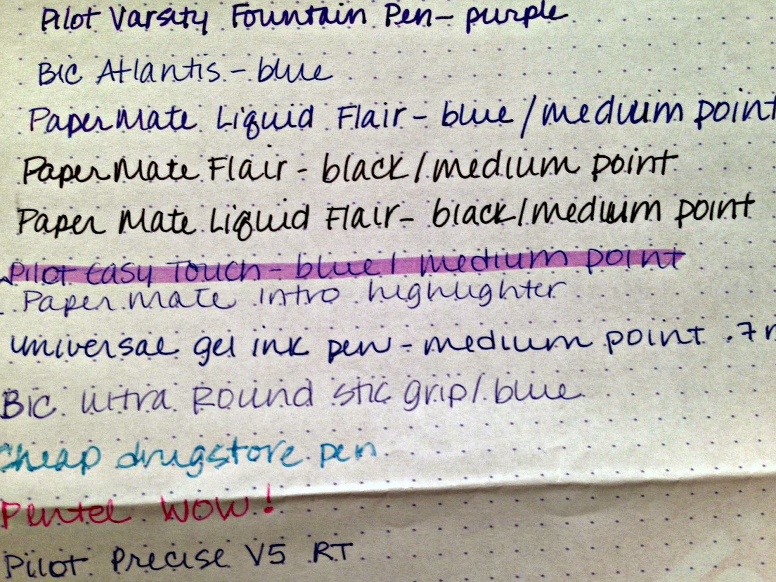
nce upon a time there was a writer named Goldilocks.  She was fascinated by quality writing paper, and lucky to receive three different Exaclair papers to sample as part of The Paper Project Week 2.

The first paper was the Clairefontaine Triomphe (white/blank 90g), which was incredibly smooth – almost slick or slippery – to the touch.  It was a clean, bright white color, with no underlying pattern or design to get in the way of Goldilocks’ doodles.  However, Goldilocks didn’t really like the way various inks (a Marvy Le Pen, several PaperMate Flairs, and a Pilot Varsity fountain pen) took to the paper.  They seemed just to sit on top of the glossy surface, without penetrating into the fiber.  After a few strokes, Goldilocks put down her pen and went on to the next paper sample.


The second sheet was the G. Lalo Verge de France (white/blank 100g).  It was a tad bit heavier than the Triomphe and although the color was described as white, in comparison to the Triomphe, it actually was ivory.   This paper had a rougher surface than the Triomphe, and some of the inks bled into it, although none soaked through to the reverse side.  When held to the light, vertical “lines,” approximately an inch apart were visible on the G. Lalo Verge de France paper, as were horizontal lines that were so closely spaced that they looked like corduroy.  When she tried to write on the G. Lalo Verge de France, the points of her pens seemed to get tripped up in the paper’s rough surface and the experience wasn’t a smooth one.  On this paper, too, after a few strokes Goldilocks put down her pen and went on to the next sample.


The last sample Goldilocks tried was the Clairefontaine GraF it (white/blank 90g).  Smoother than the G. Lalo Verge de France, but not as glassy as the Triomphe, she loved the glide of each pen over the surface, and the way the ink took to the paper.  The color, too, wasn’t the I-need-sunglasses-when-I’m-using-this-paper white of the Triomphe, but a muted white – almost a gray-white – that was exceptionally easy on the eyes.  Ink after ink, pen after pen, Goldilocks kept doodling on the GraF it, until she knew that it was the paper that was just right.


The End.

Friday, October 24, 2014

So Many Notebooks, So Much to Write, So Little Time


For as long as I can remember, I've been taken with notebooks and writing implements. First it was my box of 64 Crayola crayons with the built-in sharpener. Later it was Paper Mate's Write Bros. stick pens, and black and white marble covered composition books.

As an adult, my tastes have evolved in this realm and in recent years, I've amassed a collection of journals and notebooks from Baron Fig, Rhodia, Fabriano, Ciak, Moleskin, Miquelrius and Ecosystem.  Thanks to social media, I've also discovered a community of like-minded souls at sites that include Notebook Stories, Office Supply Geek, My Pen Needs Ink, and others. Several of these sites offer opportunities to win product give-aways and much to my delight, I've been fortunate to win a few in the last several months.

The first was a Media Enhanced (ME) Journal by Quo Vadis, which includes a QR code on each page that, when scanned using the downloadable ME app, associates a specific photo, audio file, or video file with the written information on the page. Although I have not yet found a way to use this technology in my own life at the moment, I can envisions friends who might use individual pages to store recipes, including a photo of each finished dish. (Currently, the app allows only one photo or other file to be associated with each page, ruling out the possibility of showing a series of pictures to demonstrate, for example, how to braid a challah or frost a layer cake.) Collectors might find the ME Journal useful as a log for collectibles, and recording such information as date and place of purchase, cost, and other data, as well as a photograph for each item. Similarly, it might be used to maintain a record of the contents of a safety deposit box, a wallet, or a cabinet full of insurance or medical documents.

More recently, I won a reporter style  A5 Rhodia Webnotepad, commonly known as a "Webbie." Thus far, I love the slightly-darker-than-creamsicle orange cover and the soft, smooth Clairefontaine brushed vellum 90g paper, which is lined on both sides and micro-perforated at the top. The inside back cover includes a pocket that's about half the height of the Webbie itself, and the outside back cover includes an elastic band that extends around the short side of the Webbie, and sits in a ridge on the front cover, to keep the notebook closed.  


Although I'm not yet connoisseur enough to speak knowledgable about the paper's "tooth" or other characteristics, I can report in layman's terms that it is a joy to use. I particularly appreciate the way ink in bolder, thicker points (the ones I prefer) takes to the paper. The medium point on a Paper Mate Flair is especially smooth, but hands-down, my favorite is the flow of ink from the Pilot Varsity fountain pen. (I've been using one for the last few months, and once I'm accustomed to it, I expect I will "graduate" to a more traditional model that uses interchangeable nibs and bottled ink.  For now, the Pilot Varsity suits me well.)


In the meantime, though, stay tuned because just today, I learned that I have been chosen as a participant in the Week #1 sampling group for The Paper Project.  The paper samples should arrive in the next few days, and I'm eager to compare and contrast them, as well as to see how they interact with various pens and pencils in my collection.

Friday, March 7, 2014

Where's JanetheWriter?

This week, it seems, she's everywhere...

A post I wrote following my recent colonoscopy (if you're a regular visitor to this blog, you've probably already seen it), was posted yesterday on Penn Medicine's Focus on Cancer blog.  No worries, though...I've spared you the gory details

And then, late this afternoon, I received word that a short piece I'd submitted to the blog at Rhodia Drive was live and I was today's guest blogger.

Over the weekend, look for my dad and me in greater Baltimore and Washington, DC for an unveiling.  Hard to believe it's been a year since this post

Shabbat shalom, everyone.